NOTE: I do not dislike these uniforms because they are new; I mind them because they're kinda ugly. Tradition is a fine thing, but something like this can be a nice shot in the arm every now and then. As I've written here before, I am not against new/custom/retro/special unis...if they're done right. Remember the uni-crush I had on TCU's 2009 Pro Combats? Those things were fucking awesome. These just feel uninspired. The helmet is cool* and I like the stripe running down the facemask, but the all reds with block black trim screams lack of details like they rushed them out the door. I just think we deserve better.
----------------------------------------------------
*By the way, all you non-traditionalists out there fawning over these unis, remember that our helmets were silver until Dooley took over in '64. S0 these are actually super-traditional.
-------------------------------------------------------
This morning at picture day, Georgia unveiled the Nike Pro Combat Unis they'll be wearing in the Dome. They're hideous.
 |
| Seriously, fuck you, Nike. |
Are they better than the black-helmeted abominations from Jacksonville a couple years ago? Yes. But that's like being a less smelly shit in a Waffle House bathroom.
---------------------------------------------------------
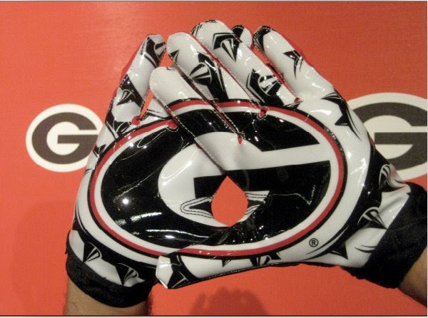
UPDATE: Here are the gloves:
 |
| Look at the collar detailing. Sweet. |
OK, that's pretty awesome. I just hope we don't get a flag happy crew that
penalizes a player for enjoying how the gloves are designed.
------------------------------------------------
Another Update: OK, this pic makes me a feel a
little better - you get a better feel for the jersey and helmet than in the Nike pics above (h/t dawgsports). It still feels too plain; like Nike couldn't be bothered to really put any detail or nuance into anything under the collar.


No comments:
Post a Comment